Choosing living room colors requires strategic consideration of multiple factors for best results. Start by evaluating natural light exposure, as north-facing rooms need warmer tones while south-facing spaces can handle cooler hues. Consider room dimensions, using lighter shades for small spaces and deeper tones for larger areas. Personal style preferences should guide color selection, while color psychology influences mood and atmosphere. Test paint samples in different lighting conditions throughout the day, and guarantee colors flow harmoniously with adjacent rooms. Consider architectural features and existing elements like flooring and furniture. These fundamental principles lay the groundwork for creating your perfect color palette.
Key Takeaways
- Consider your room's natural light direction, as north-facing spaces need warmer colors while south-facing rooms can handle cooler tones.
- Test paint samples on multiple wall sections and observe them throughout different times of day before making final decisions.
- Use light colors in small spaces to create depth, while larger rooms can accommodate darker accent walls for visual interest.
- Select colors that align with your personal style preferences rather than solely following current design trends.
- Factor in your floor color and architectural elements as foundational components when choosing wall colors and accent pieces.
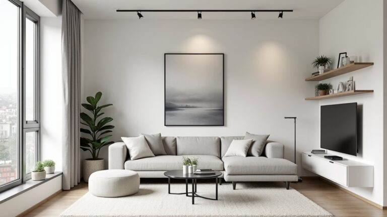
Consider Natural Light Levels
Natural light plays a decisive role in how paint colors appear throughout the day in your living room.
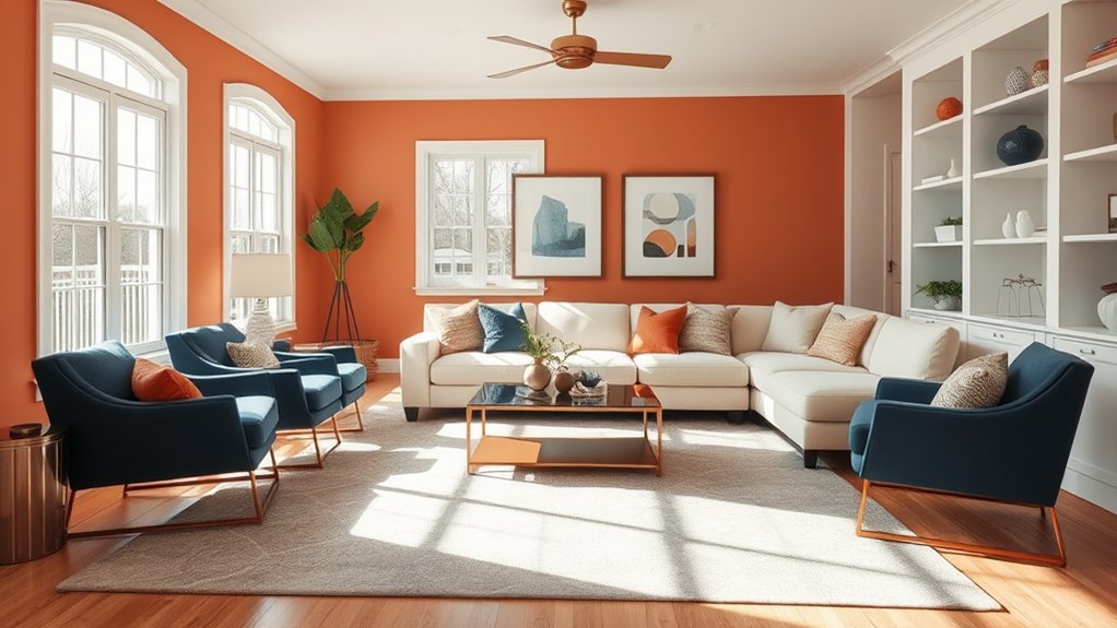
Rooms facing north tend to receive cooler light, making warm colors appear muted, while south-facing spaces enhance color trends toward warmer tones. Understanding these lighting effects helps prevent choosing shades that become too intense or dull as natural illumination shifts from morning to evening. Consider using daylight-mimicking bulbs in areas with limited natural light to ensure consistent color appearance throughout the space.
Assess Room Size
Beyond lighting considerations, the dimensions of your living room substantially influence color selection.
Compact spaces benefit from lighter hues that create depth and openness, while larger rooms can accommodate deeper tones. Consider your room layout and furniture arrangement when selecting colors – darker accent walls can help define zones, while consistent light colors maximize the perception of space.
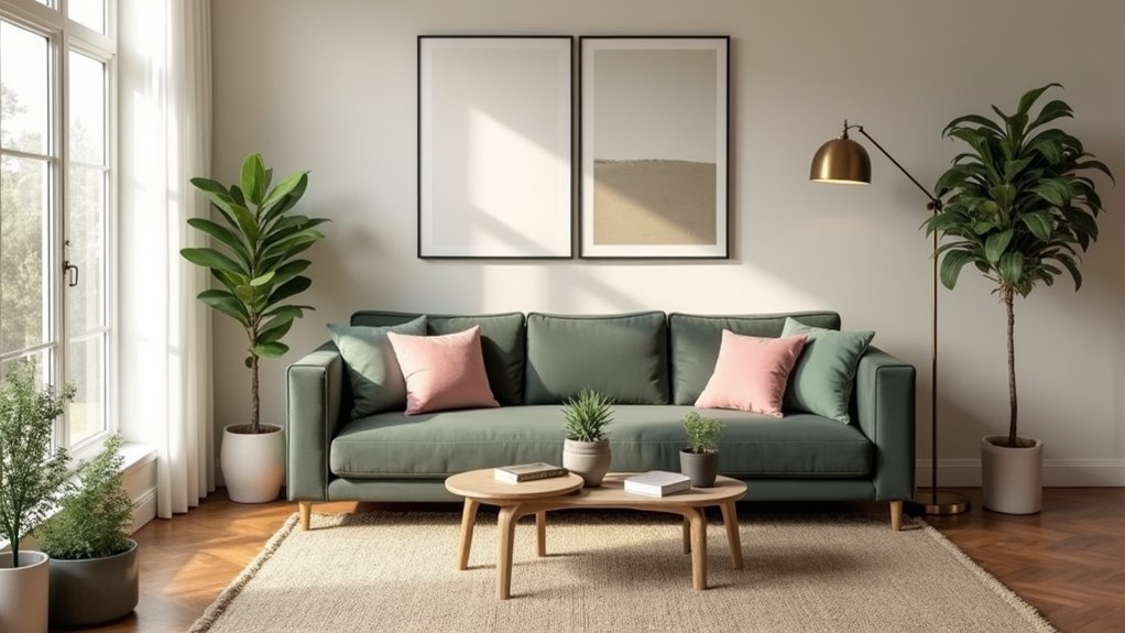
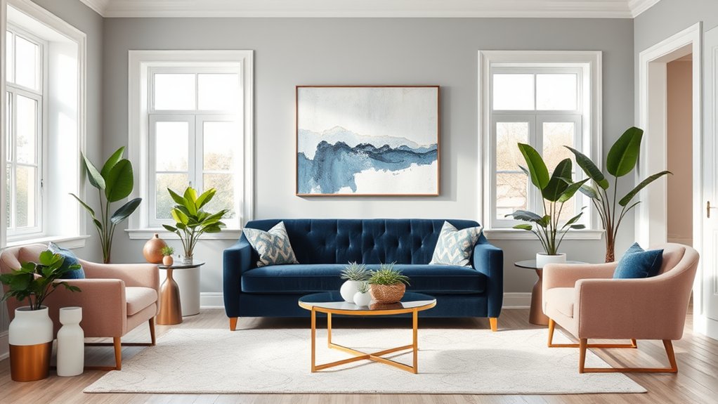
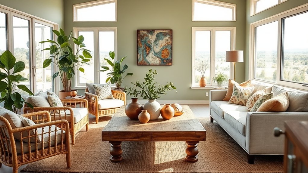
Soft pastels like dove grey, vanilla cream, and robin's egg blue can subtly reflect natural light to make any space feel more expansive.
Define Your Color Personality
Your personal color preferences play a vital role in creating a living space that reflects your individuality and enhances your daily comfort.
While color trends may influence design choices, your personal style should guide the selection process.
Consider which hues consistently draw your attention, make you feel energized or relaxed, and align with your lifestyle.
These instinctive color attractions often reveal your authentic design preferences.
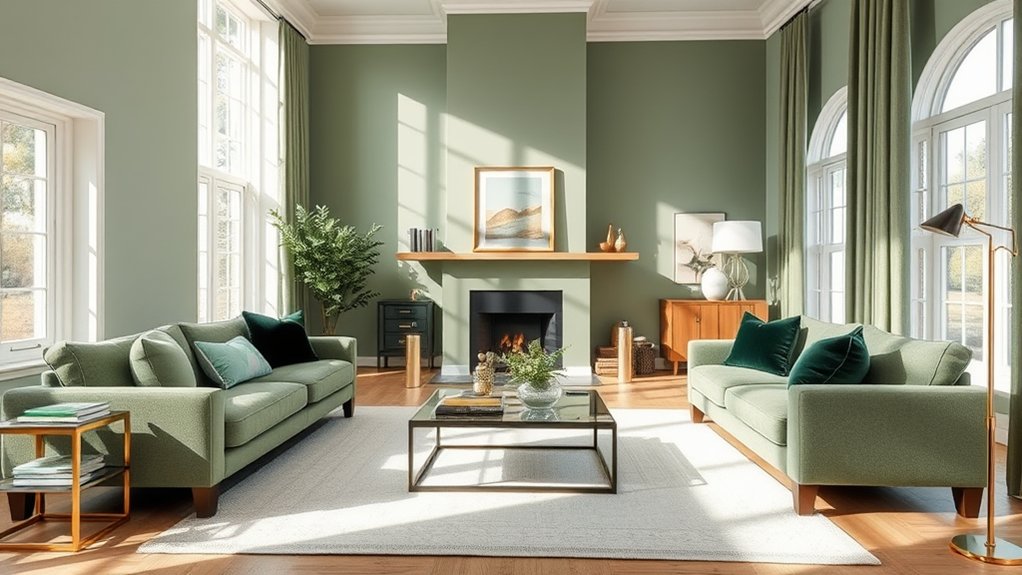
For a serene atmosphere, take inspiration from Scandinavian minimalism which emphasizes monochromatic color schemes and natural light.
Study Color Psychology
Understanding color psychology is essential when selecting living room hues, as different colors can dramatically influence emotions and behavior in your space.
Research shows that warm colors like red and orange can energize a room, while cool tones such as blue and green promote relaxation and tranquility.
Beyond individual responses, cultural associations with colors vary globally, making it vital to think about both personal and cultural context when creating your living room's color palette.
Mood Effects of Colors
Color psychology plays a vital role in creating the desired atmosphere within a living room space.
Different hues evoke specific emotional responses – blues promote tranquility, yellows energize, and greens balance harmony.
When developing color harmony through mood boards, consider how warm tones stimulate conversation while cool tones encourage relaxation.
Understanding these psychological effects guarantees your living room elicits the intended emotional response.
Cultural Color Meanings
When selecting living room colors, cultural interpretations can substantially impact design choices across different societies and regions.
Color symbolism varies markedly between cultures – red may represent luck in Chinese culture but danger in Western societies.
Understanding these cultural associations helps designers create spaces that respect and reflect the occupants' heritage while avoiding potentially inappropriate or offensive color combinations.
Emotions Through Color Schemes
Beyond cultural interpretations, the psychological impact of color schemes plays a fundamental role in shaping the emotional atmosphere of living spaces.
Color emotions manifest differently in each individual, with hue preferences influencing mood and behavior. Cool blues and greens typically evoke tranquility, while warm reds and oranges stimulate energy and conversation. Understanding these psychological responses helps create intentionally balanced living environments.
Test Paint Samples
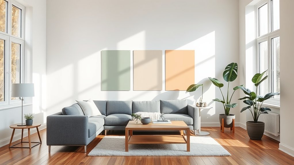
Testing paint samples requires a strategic approach to guarantee accurate color assessment in your living space.
Apply samples to multiple wall sections, including areas near windows and interior corners, to evaluate how the colors interact with both natural daylight and artificial lighting conditions.
Observe these test patches at various times throughout the day, from morning brightness to evening shadows, as colors can shift dramatically under changing light conditions.
Paint Multiple Wall Areas
Paint samples are essential for making informed color decisions, as lighting conditions can dramatically alter how colors appear in your living room.
Apply color swatches on multiple wall areas to observe how the paint interacts with different wall textures and lighting throughout the day.
Test samples on both north and south-facing walls, near windows, and in shadowed corners.
Natural Vs Artificial Light
Natural and artificial lighting create distinctly different effects on wall colors throughout the day.
Testing paint samples under various light sources is vital for achieving ideal color harmony.
Morning sunlight often reveals warm undertones, while evening artificial lighting can dramatically alter color perception.
Evaluate samples during different times and lighting conditions before making final color selections.
Different Times of Day
Throughout three key periods of the day, wall colors can display remarkably different characteristics that impact the overall aesthetic of your living space.
Test paint samples during morning light, afternoon sun, and evening hours to observe how time changes affect your chosen hues.
Natural day cycles create shifting shadows and color intensities, making it essential to evaluate paint colors across different lighting conditions.
Match Existing Furniture Colors
When selecting paint colors for your living room, your existing furniture pieces serve as crucial anchors for the overall color scheme.
Consider the dominant hues in your upholstery, wood tones, and accent pieces.
Different furniture styles can guide your color direction – traditional pieces often pair well with warm neutrals, while contemporary room decor may favor cooler, more dramatic wall colors.
Follow the 60-30-10 Rule
The 60-30-10 rule provides a foolproof formula for balancing colors in your living room design scheme.
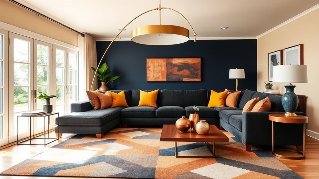
This principle creates color harmony by dedicating 60% to a dominant color for walls and large furniture, 30% to a secondary color for accent pieces and textiles, and 10% to a bold accent color for room decor elements like throw pillows, artwork, and accessories.
Incorporate Seasonal Changes
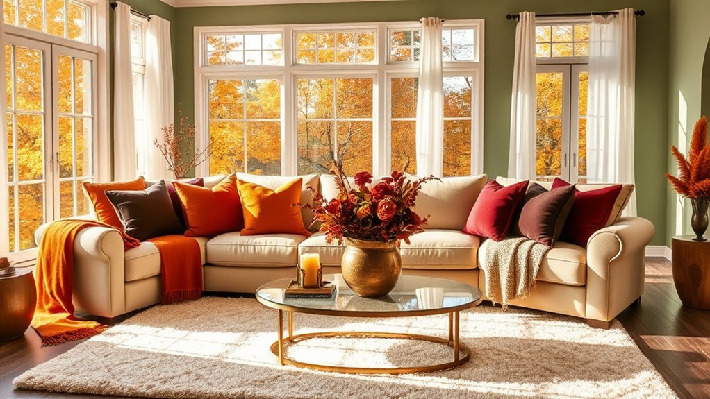
Building on your established color foundation, seasonal changes offer dynamic opportunities to refresh your living room's appearance throughout the year.
Incorporate seasonal hues through easily changeable elements like throw pillows, artwork, and decorative accessories.
Winter whites and deep greens can shift to spring pastels, while summer brights evolve into warm autumn tones.
This approach allows you to stay current with color trends while maintaining your core palette.
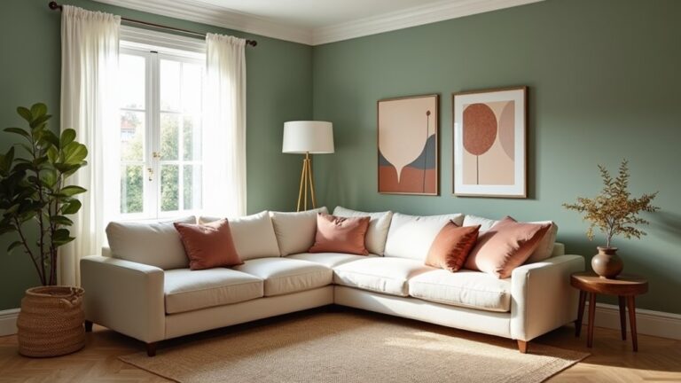
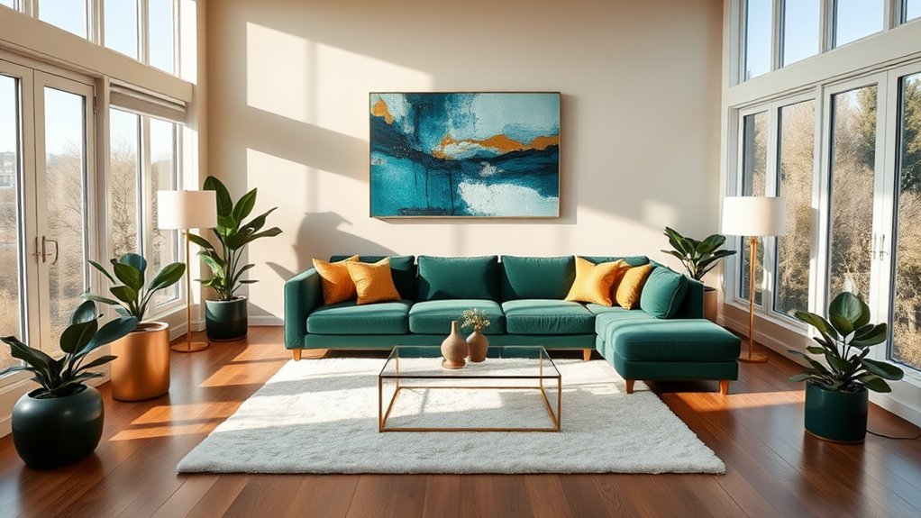
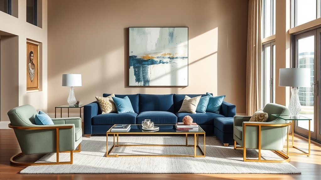
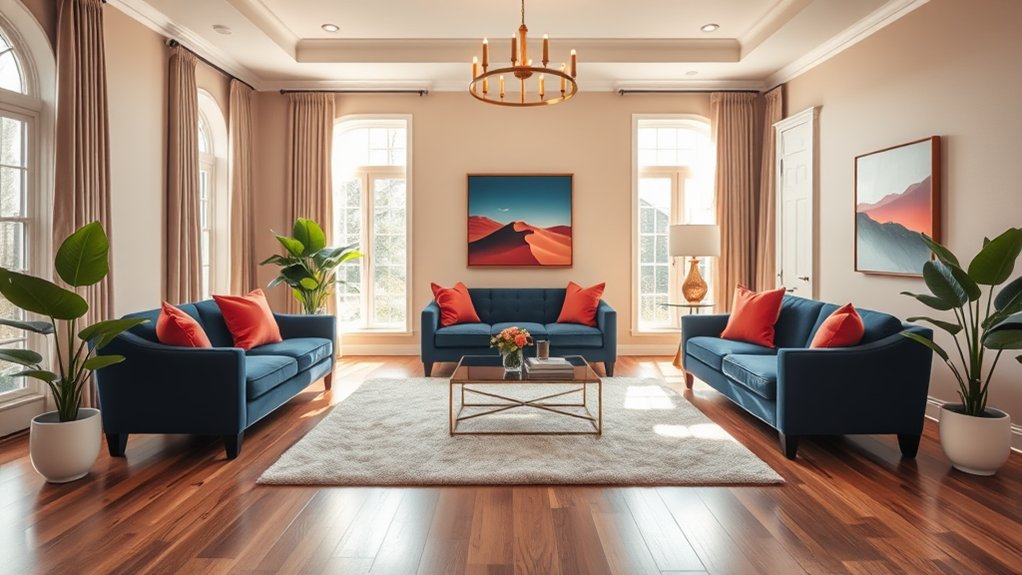
Balance Warm and Cool Tones
Creating visual harmony in your living room requires a thoughtful balance between warm and cool color tones.
For ideal color harmony, pair warm elements like reds, oranges, and yellows with cooler shades such as blues, greens, and purples.
Achieve tone balance by using the 60-30-10 rule: 60% dominant color, 30% secondary color, and 10% accent color throughout the space.
Use Color Temperature Effectively
Understanding the interplay between warm and cool color temperatures creates visual interest and depth in living room design.
The strategic placement of warm tones against cool elements establishes focal points while maintaining visual harmony throughout the space.
Natural and artificial lighting substantially influences color temperature perception, making it essential to weigh both daytime and evening ambiance when selecting your palette.
Warm Vs Cool Contrasts
When selecting living room colors, the interplay between warm and cool tones can dramatically influence the space's visual dynamics and emotional atmosphere.
Creating color harmony through strategic tone contrast can be achieved by pairing warm oranges, reds, or yellows with cooler blues, greens, or purples. This balanced approach adds depth and visual interest while maintaining a sophisticated and cohesive design aesthetic.
Balance Temperature With Light
The relationship between color temperature and lighting can transform how warm and cool tones manifest in your living room.
Natural daylight reveals true color harmony, while artificial lighting can alter perceptions.
South-facing rooms handle cool colors better, while north-facing spaces benefit from warm neutrals to counteract limited light.
Consider how different lighting conditions throughout the day affect your color choices.
Evaluate Your Floor Color
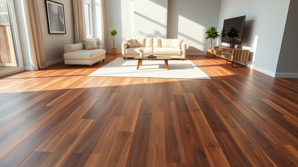
Your floor color serves as the foundation for your entire living room color scheme.
When conducting a floor analysis, consider whether you have warm wooden tones, cool marble, or neutral carpeting. Use your flooring as color inspiration for wall colors and furnishings, selecting hues that either complement or purposefully contrast with the floor's dominant shades to create a cohesive design flow.
Consider Architectural Features
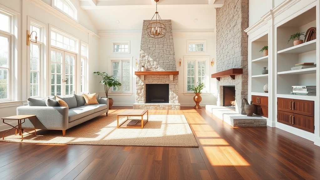
As you develop your living room color scheme, prominent architectural elements like crown molding, built-in shelving, exposed beams, and fireplaces play a crucial role in determining ideal paint choices.
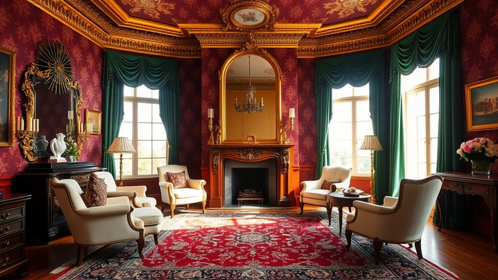
Consider your home's architectural style when selecting colors – Victorian homes suit rich jewel tones, while modern spaces embrace minimalist neutrals.
Highlight distinctive design elements by using contrasting or complementary colors to enhance their visual impact.
Review Current Color Trends
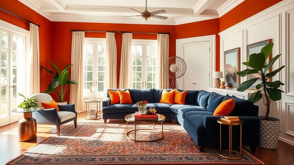
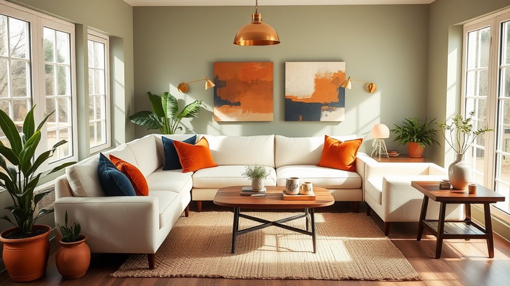
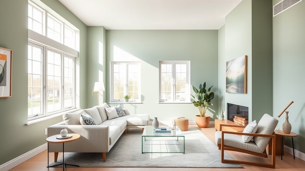
The 2024 color trends showcase a harmonious blend of earth-inspired neutrals and sophisticated jewel tones, with sage green and warm terracotta leading the residential paint selections.
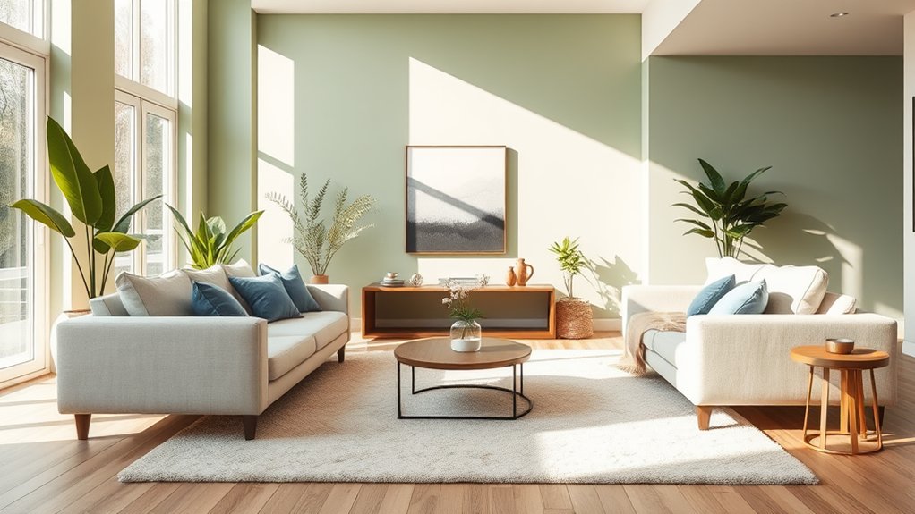
Contemporary living rooms are embracing tonal color combinations that pair muted blues with soft grays, or warm beiges with rich chocolate browns, creating layered, sophisticated spaces.
These trending palettes reflect a growing preference for colors that promote both tranquility and visual interest, while maintaining long-term design versatility.
Popular Paint Colors 2024
Popular paint colors for 2024 reflect a significant shift toward natural, calming hues that promote wellness and connection to the environment.
Color trends emphasize warm earth tones, including rich terracotta, sage green, and warm taupe. Paint options feature muted blues reminiscent of coastal waters, soft clay neutrals, and grounding shades of brown, creating serene spaces that balance modern aesthetics with organic warmth.
Color Combinations in Demand
Leading interior designers have identified several compelling color combinations that define current living room trends.
Deep sage paired with warm beige creates a sophisticated atmosphere, while charcoal gray combined with soft cream remains a timeless choice.
Contemporary color trends also embrace earthy terracotta with neutral hues for balance, and maritime blue paired with warm whites for coastal elegance.
Factor In Room Function
Room function plays a vital role in selecting appropriate living room colors.
When the space primarily hosts formal gatherings, sophisticated neutrals and deep jewel tones create an elegant atmosphere.
Conversely, rooms dedicated to family activities benefit from energetic yet durable color schemes.
Consider warmer hues for social spaces and cooler tones for areas meant for relaxation and conversation.
Connect Adjacent Spaces
Beyond the living room's primary function, the colors you select must harmonize with adjacent spaces to create a cohesive home environment.
This is particularly vital in open concept layouts, where rooms flow seamlessly into one another. Consider using complementary or analogous color schemes across shared spaces to establish visual continuity while maintaining each room's distinct identity through varying color intensities and accent choices.
Layer Similar Shades
Creating visual depth in your living room starts with layering similar shades of your chosen color palette.
Using tonal variations within the same color family allows you to build sophisticated dimension while maintaining cohesion throughout the space.
These subtle gradations can be achieved through textiles, paint finishes, and decorative elements that share undertones but vary in intensity or value.
Tonal Color Variations Work
Layering different shades of the same color can transform a living room into a sophisticated and visually engaging space.
Working with tonal variations creates natural color harmony while maintaining visual cohesion.
For successful palette creation, select three to four distinct shades within the same color family, ranging from light to dark.
This approach adds depth and dimension without overwhelming the room's atmosphere.
Creating Depth Through Layers
The strategic placement of similar color shades adds visual depth to your living room, making the space appear more dynamic and thoughtfully designed.
Layer complementary tones through textiles, wall treatments, and decor to enhance color harmony and depth perception.
Consider using darker shades for anchoring elements like rugs or accent walls, while incorporating lighter variations in furniture and accessories.
Create Focal Points
Focal points serve as visual anchors that guide the eye through your living room's color scheme.
Strategic placement of color accents can establish powerful focal points, whether through a vibrant accent wall, statement artwork, or bold furniture pieces.
Consider using contrasting colors to enhance these focal points, ensuring they command attention while maintaining harmony with the room's overall palette.
Mind the Room's Orientation
When selecting living room colors, the orientation of your space plays a vital role in how light affects the perception of your chosen palette throughout the day.
North-facing rooms benefit from cool tones that maximize available light, while south-facing spaces can handle warmer hues that balance intense natural illumination. Understanding your room's daily sun patterns allows you to strategically select colors that maintain their intended visual impact from morning through evening.
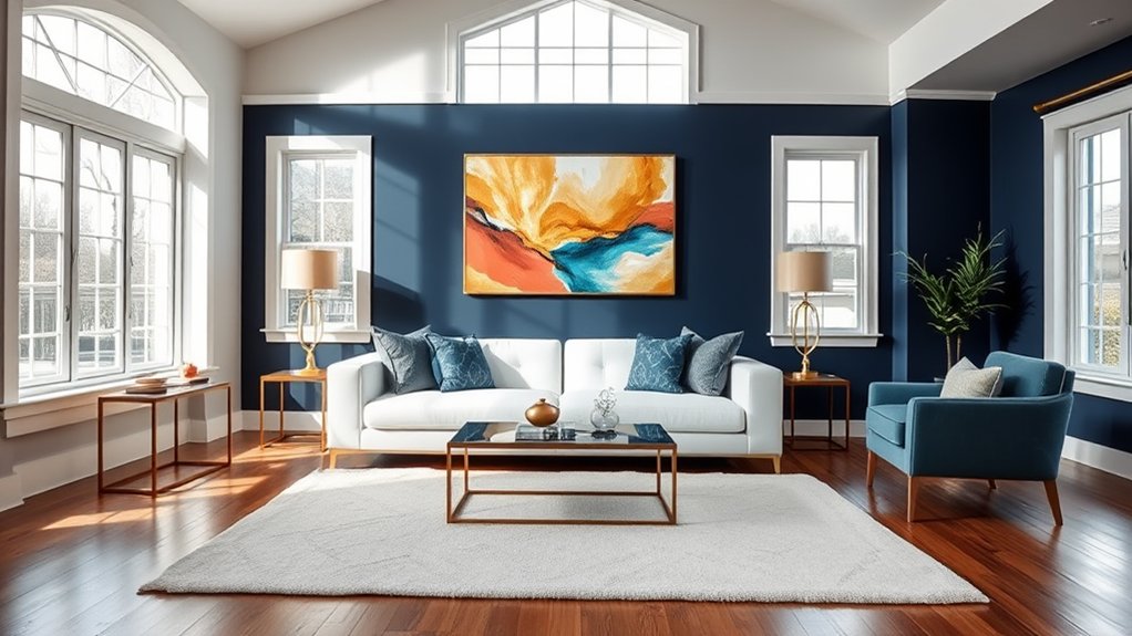
North Light Best Cool
Rooms facing north tend to receive cooler, indirect sunlight throughout the day, making them ideal candidates for cool-toned color schemes.
When planning north decor, embrace colors like soft blues, gentle grays, and crisp whites to maximize the available light.
Cool tones naturally complement northern exposure, creating a serene atmosphere while helping to maintain visual balance in spaces with limited natural warmth.
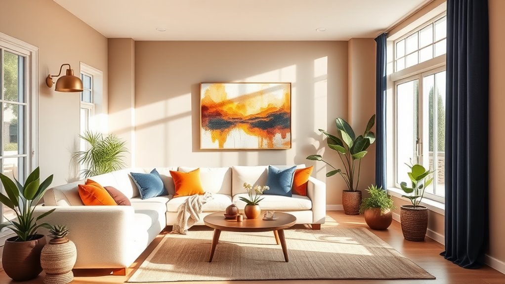
South Facing Needs Warmth
In contrast to north-facing spaces, south-facing living rooms benefit from abundant natural sunlight, which can sometimes create an overwhelming brightness that needs tempering.
Current color trends suggest incorporating warm earth tones and rich terracotta hues to create balance.
When planning room decor, consider deep browns, muted oranges, and warm grays to absorb intense light while maintaining a welcoming atmosphere.
Consider Daily Sun Patterns
Throughout the day, natural light shifts dramatically in intensity and angle, making it essential to analyze your living room's sunlight patterns before selecting paint colors.
Observe your space at different hours to understand how lighting effects transform wall colors. Current color trends may look ideal in morning light but appear drastically different by afternoon, impacting the overall ambiance of your living space.
Consider Ceiling Color
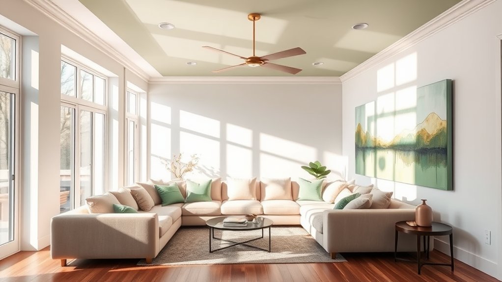
Ceilings play a pivotal role in establishing the overall visual harmony of your living room's color scheme.
When selecting ceiling colors, consider both ceiling height and ceiling texture.
Lower ceilings benefit from lighter shades to create an illusion of height, while higher ceilings can accommodate darker tones for a more intimate feel.
Textured ceilings may require specific paint finishes to minimize surface irregularities.
Reflect Your Personal Style
When selecting living room colors, your personal style should serve as the foundation for all design decisions.
Your individual preference in art, fashion, and lifestyle naturally guides color choices that resonate with you.
While design principles matter, personal taste ultimately determines whether you gravitate toward bold jewel tones, soft neutrals, or vibrant Mediterranean hues for your living space.
Blend Indoor Outdoor Elements
Creating a seamless shift between indoor and outdoor spaces can substantially influence your living room color palette.
Consider drawing inspiration from your garden views, incorporating natural greens, earthy browns, and sky blues. Harmonize outdoor decor elements by selecting paint colors that echo the landscape beyond your windows, establishing visual continuity between interior and exterior environments.
Plan Color Flow
Planning out the color flow between connecting rooms sets up a cohesive visual journey throughout your home.
Effective color planning considers how adjacent spaces interact visually, using complementary or analogous color schemes to create seamless shifts.
Consider using a primary color palette that extends through doorways and hallways, while incorporating accent colors to maintain room harmony without disrupting the overall design continuity.
Address Room Challenges
Each living room presents unique design challenges that must be addressed through strategic color choices.
Low ceilings can be visually heightened with lighter tones, while overly large spaces benefit from deeper hues that create intimacy.
When working with awkward room layouts or mismatched furniture styles, unified color schemes can help harmonize disparate elements and create a more cohesive space.
Honor Historical Context
Beyond addressing spatial challenges, the choice of living room colors should reflect and honor the architectural era of your home.
When engaged in historic preservation, research period-appropriate color palettes that align with your home's original design aesthetic. Consider the cultural heritage of the architecture – Victorian homes often featured rich jewel tones, while Mid-Century Modern embraced earthy neutrals and bold accents.
Coordinate Accent Colors
Coordinating three to four accent colors creates visual harmony and depth in your living room design scheme.
Select complementary or analogous hues that flow naturally together while maintaining proper color harmony.
Consider using accent walls to showcase dominant colors, then incorporate secondary shades through textiles, artwork, and decorative elements.
This layered approach guarantees a cohesive and sophisticated living space.
Frequently Asked Questions
How Often Should I Repaint My Living Room Walls?
Professional designers recommend repainting living room walls every 3-5 years, though wall decor preferences and evolving paint trends may influence timing. High-traffic areas might require more frequent updates.
What's the Best Paint Finish for Hiding Wall Imperfections?
Flat or matte finishes effectively conceal wall texture imperfections by minimizing light reflection. These low-sheen paints absorb light rather than reflect it, making surface irregularities and flaws less noticeable.
Can I Mix Metallic Finishes With My Chosen Color Scheme?
Mixing metallic accents in different finishes can create sophisticated depth when thoughtfully coordinated. Gold, silver, and copper can harmoniously coexist within color combinations when balanced through intentional placement and proportion.
How Do I Remove Stubborn Paint Samples From My Walls?
Like erasing Leonardo's practice sketches, paint sample removal requires gentle yet effective methods. Use warm, soapy water or rubbing alcohol, followed by thorough wall cleaning with a non-abrasive sponge.
Should I Match My Curtains Exactly to My Wall Color?
Professional designers recommend creating color harmony rather than exact matches. Consider selecting curtain styles in complementary or coordinating shades to add depth and visual interest to your space.
Conclusion
Selecting living room colors requires thoughtful consideration of multiple design elements, from natural illumination to architectural features. A methodical approach – much like the meticulous color-matching techniques used by Renaissance fresco painters – guarantees harmonious results that enhance spatial perception and emotional resonance. By carefully evaluating light patterns, room dimensions, psychological impact, and historical context, while testing samples in various conditions, designers can create sophisticated, cohesive spaces that seamlessly integrate with the home's overall aesthetic.