When selecting a living room color scheme, start by considering the psychological effects of different hues – warm tones energize while cool tones relax. Analyze your existing furniture and architectural features to identify foundation colors that will create visual cohesion. Natural light substantially impacts how colors appear, so test paint samples at different times of day. Balance warm and cool tones while considering room size; lighter hues expand space while darker tones create intimacy. Incorporate seasonal adaptability through neutral base colors with interchangeable accent pieces. Strategic color placement and thoughtful combinations reveal endless possibilities for creating your perfect living space.
Key Takeaways
- Begin with a neutral foundation color that allows flexibility for seasonal changes and evolving design preferences.
- Consider the room's natural light exposure and size when selecting colors, as these factors significantly impact color appearance.
- Use the color wheel to create harmonious combinations, focusing on complementary or analogous color schemes.
- Select accent colors based on existing furniture and architectural features to create a cohesive, well-planned space.
- Test paint samples in different lighting conditions before committing to ensure colors achieve the desired psychological effect.
Understanding Color Psychology
When selecting colors for your living room, understanding the psychological impact of different hues is essential for creating the desired atmosphere.
While color trends evolve, certain principles remain constant: warm tones like red and orange energize spaces, while cool blues and greens promote relaxation.
Design inspiration should align with these psychological effects to achieve the perfect balance between aesthetics and emotional comfort in your living space.
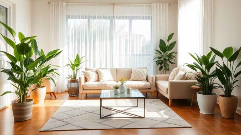
Earth tones and pastels provide a soothing backdrop that nurtures warmth and serenity in your living room design.
Popular Color Combinations
Modern interior design embraces two dominant approaches to color combinations that consistently prove successful in living room spaces.
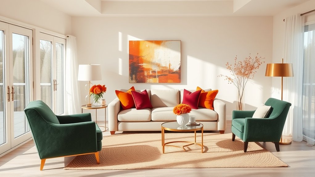
Classic neutrals paired with bold accent colors create timeless sophistication, often utilizing shades of gray, beige, or cream alongside vibrant jewel tones or earthy terracotta.
Contemporary blue color schemes offer versatile options, from navy and white coastal themes to sophisticated pairings of slate blue with metallic finishes, demonstrating the enduring appeal of this versatile hue in current design trends.
Natural materials and textures add depth and visual interest when incorporated into any chosen color scheme, creating a harmonious living space.
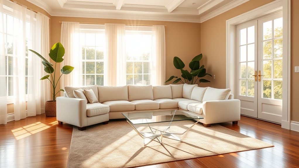
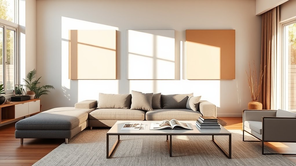
Classic Neutrals and Accents
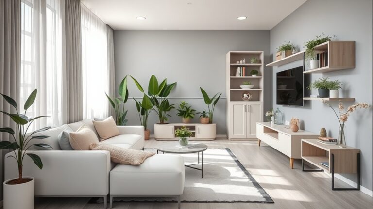
Throughout interior design history, classic neutral color schemes have remained a cornerstone of sophisticated living room design, offering timeless appeal and versatile decorating possibilities.
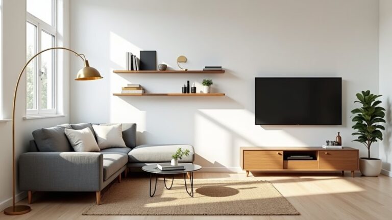
Beige, gray, and cream tones create perfect backdrops for wall decor while accommodating various furniture styles.
These foundational hues can be enhanced with metallic accents, rich wood tones, or bold color elements for dynamic visual interest.
Natural light elements like sheer curtains help maximize brightness while maintaining the serene neutral atmosphere.
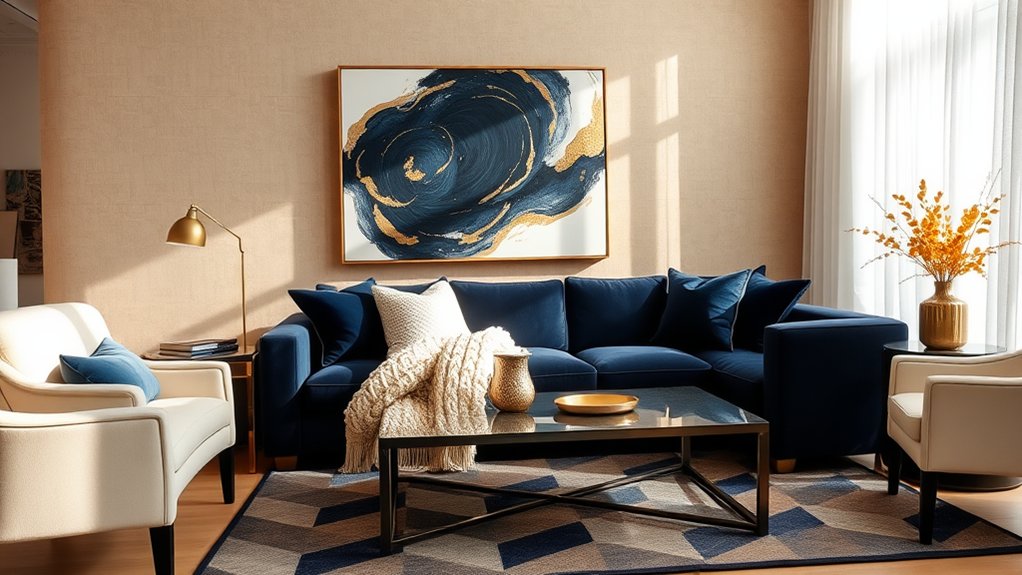
Contemporary Blue Color Pairings
Today's most sought-after blue color pairings blend timeless sophistication with contemporary flair in living room design.
Deep navy paired with crisp white creates dramatic contrast, while softer blue hues combined with warm grays offer refined tranquility.
Coastal tones like aqua harmonize naturally with sandy beiges and silver accents, delivering a fresh, modern aesthetic that remains enduringly elegant.
Working With Existing Furniture
Selecting a color scheme around existing furniture presents one of the most practical approaches to living room design.
Analyze your furniture style and room layout to identify dominant colors and undertones within upholstery, wood finishes, and decorative pieces.
Use these existing elements as foundation colors, then build complementary wall colors and accent pieces that enhance your current furniture while maintaining visual cohesion.
Natural Light Considerations
Natural light profoundly influences how colors appear in your living room throughout the day, making it a critical factor in choosing your color scheme.
North-facing rooms receive cooler lighting effects, requiring warmer paint colors to compensate, while south-facing spaces can handle cooler tones.
Consider window treatments that help regulate natural light intensity, as this directly impacts how your chosen colors present themselves.
Color Wheel Basics
The color wheel serves as a fundamental tool for understanding how different hues interact and create harmonious combinations in interior design.
Primary colors – red, blue, and yellow – form the foundation of all other colors and occupy equidistant positions on the wheel.
Complementary color schemes, which pair colors opposite each other on the wheel, create dynamic visual tension and can establish striking focal points in your living room design.
Understanding Primary Colors
Before choosing your living room colors, mastering the fundamentals of color theory is essential.
Primary colors – red, yellow, and blue – form the foundation of all other hues through pigment mixing.
These pure, unmixable colors serve as the building blocks for creating secondary and tertiary colors.
Understanding primary colors enables you to make informed decisions about your living room's color palette.
Complementary Color Schemes
Across from each other on the color wheel, complementary colors create dynamic visual tension and maximum contrast when paired together.
While these pairings offer bold statements, they can overwhelm a living space if not properly balanced. Consider using one color as dominant and its complement as an accent. This approach provides color harmony while avoiding the intensity of equal complementary proportions. For a softer effect, integrate analogous palette variations.
Accent Colors and Focal Points
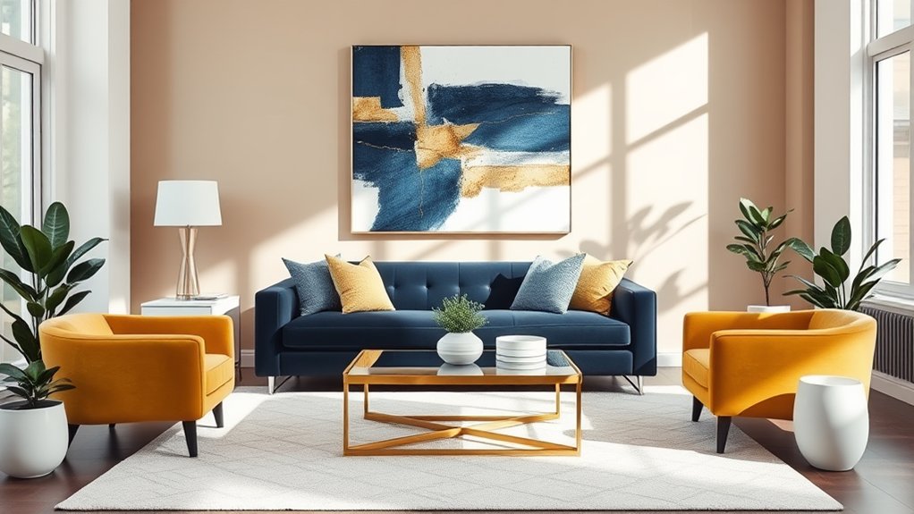
Creating visual interest in your living room relies heavily on strategic use of accent colors and carefully chosen focal points.
Select 1-2 bold accent hues that maintain color harmony while energizing the space.
Position decorative accents like artwork, textiles, or architectural features to draw the eye naturally through the room.
These elements should complement rather than compete with your primary color palette.
Testing Paint Samples
When selecting paint colors for your living room, testing samples in the actual space is an essential step that can prevent costly mistakes.
Begin by collecting paint swatches and purchasing color testers of your shortlisted shades. Apply large sample patches on different walls and observe them throughout the day, as natural and artificial lighting will substantially affect how colors appear in your space.
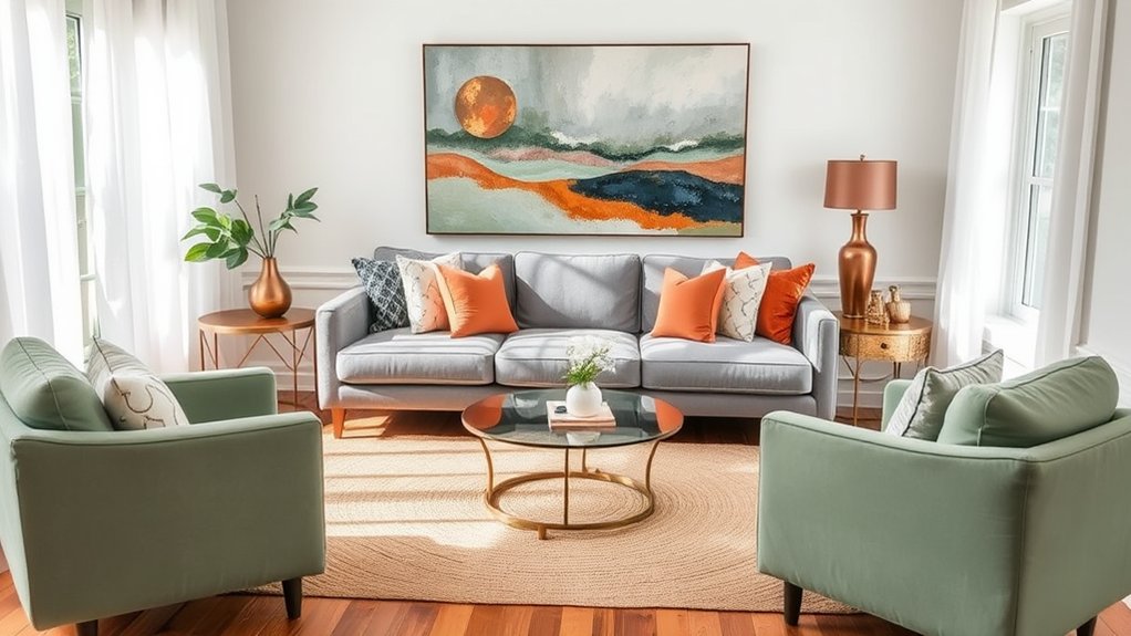
Balancing Warm and Cool Tones
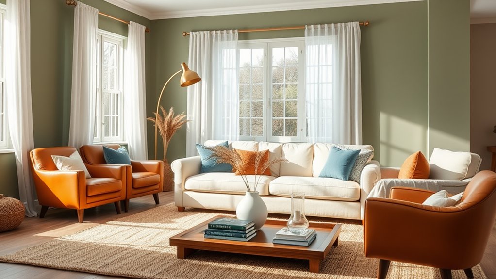
A thoughtfully balanced color scheme incorporating both warm and cool tones creates visual interest and dynamic energy in your living room.
The strategic use of contrasting colors adds depth to the space, preventing a flat or monotonous appearance while establishing distinct focal points and layers.
Pairing complementary temperatures, such as rich terra cotta with steel blue or golden yellow with cool gray, produces a sophisticated harmony that appeals to both aesthetic and psychological sensibilities.
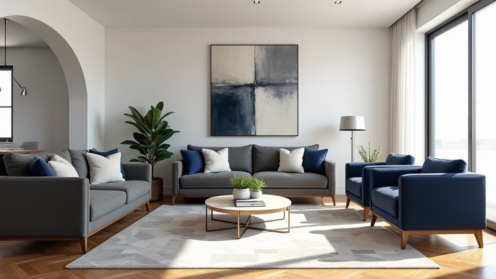
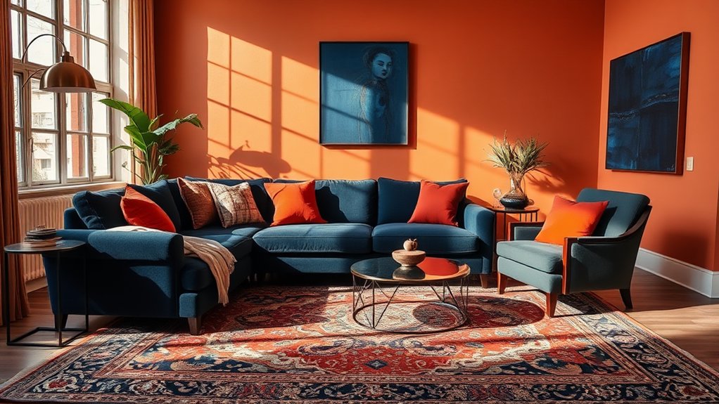
Contrasting Colors Create Depth
The strategic interplay of contrasting colors can transform a living room from flat to dynamic by creating visual depth and dimension.
Pairing dark shades with light hues establishes distinct focal points and spatial layers within the space. Consider charcoal against cream or navy against white to create dramatic depth perception. These purposeful contrasts help define zones and add architectural interest without structural changes.
Complementary Temperature Combinations
Through deliberate pairing of warm and cool tones, living room color schemes achieve ideal visual harmony and psychological balance.
Combining warm amber or terracotta with cool slate blue creates temperature balance, while pairing sunny yellows with deep purples maintains color harmony.
Strategic placement of these opposing temperatures through furnishings, walls, and decor elements guarantees a sophisticated, well-calibrated living space.
Room Size and Color Impact
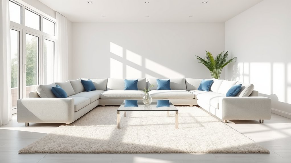
Color selection plays a pivotal role in manipulating visual perceptions of room dimensions, making it a crucial consideration when designing living spaces.
Light hues expand spatial perception, ideal for compact areas, while darker tones create intimacy in larger rooms. Strategic color placement can influence furniture layout and enhance room decor by drawing attention to architectural features or concealing spatial limitations.
Seasonal Color Adaptability
Many successful living room designs incorporate adaptable color schemes that shift smoothly across seasons, offering visual comfort throughout the year.
Consider neutral base colors complemented by interchangeable accent pieces that reflect seasonal shifts.
While color trends evolve, maintaining versatile foundation tones allows for easy updates through textiles, artwork, and decorative elements that shift naturally between warm and cool seasons.
Frequently Asked Questions
How Do I Fix Paint Color Mistakes Without Repainting the Entire Wall?
For minor paint color mistakes, perform careful color correction using sample swatches, then apply precise paint touchups with feathered edges, using identical paint finish and appropriate application tools.
What's the Best Paint Finish for Hiding Wall Imperfections?
Flat or matte paint finishes are ideal for concealing wall textures and imperfections. These low-luster paint sheens minimize light reflection, effectively camouflaging surface flaws, dents, and minor irregularities.
How Long Should I Wait Between Coats When Painting My Living Room?
While some rush between applications, proper paint drying requires 2-4 hours between coats in ideal conditions. For best adhesion and finish, wait 24 hours before applying the final coat.
Can I Use the Same Color Scheme in Connected Rooms?
Using connected colors in adjoining spaces creates visual color continuity and room cohesion. Consider varying shades or tones within the same palette to maintain flow while giving each space distinct character.
How Do Different Types of Artificial Lighting Affect My Chosen Paint Colors?
Different artificial lighting effects dramatically influence paint colors. Cool LED lighting can make colors appear bluish, while warm incandescent lighting enhances warm tones. Color temperature substantially impacts the final aesthetic appearance.
Conclusion
The art of selecting living room colors balances scientific precision with aesthetic intuition. While warm tones create intimate spaces, cool palettes expand visual boundaries. Natural light interplays dramatically with chosen hues, transforming rooms from dawn to dusk. Through methodical color wheel applications and strategic sample testing, the ideal scheme emerges – one that harmonizes with existing furnishings while adapting to seasonal changes. The result: a living space that reflects both timeless design principles and contemporary sensibilities.